6 Simple Tips For Improving Your Color Photography
Most photographers mainly work with color photography. Yet how often do you really think about color when composing an image? Color can be an important aspect in creating a strong composition. It can also lend a particular mood to an image. In this article we'll have a look at how you can use color to create strong images.

Using color to draw attention
Color can be used very effectively to draw the viewer's eye to a certain part of an image. If the color of the subject contrasts with the color of the rest of the image, the eye will immediately be drawn in by this contrast.
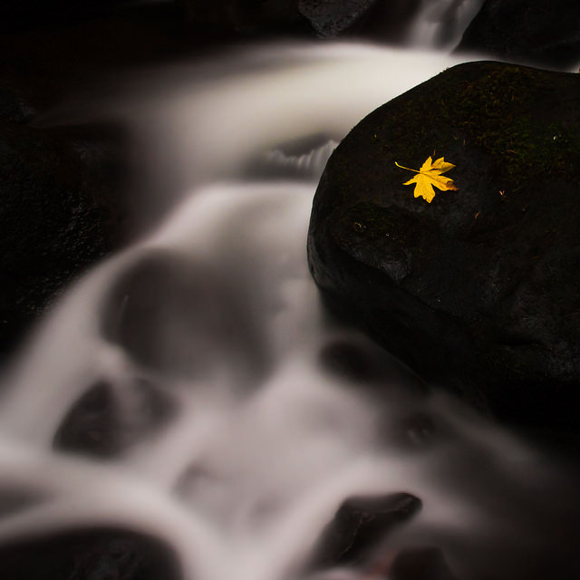
Dry Creek by Luke Detwiler on Flickr (licensed CC-BY)
This technique works best when the subject is strongly colored. The rest of the scene can either be neutral in color (e.g. gray, white, black) or some contrasting color. A complementary color is ideal. For example, a yellow subject against a purple backdrop, orange subject against a blue background, or green subject against a burgundy background (or vice versa).
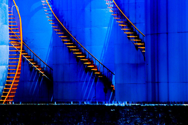
Stairs by Petrov Escarião on Flickr (licensed CC-BY)
Using analogous colors does not work so well for this technique (e.g. orange and yellow), unless there is also a large difference in tone (brightness) or saturation between the two colors.
Blast your viewer with color
I'm not suggesting your should always produce images with highly saturated colors, indeed further down in this article you'll find a tip recommending minimal saturation. But there are some subjects that have very strong colors naturally. Don't be afraid to ensure your image conveys these strong colors.
Examples might be a sunset, the bright colors of fall leaves, or the strong greens of leaves in the summer. Photos of these subjects, showing off their highly saturated colors can capture the viewer's attention.
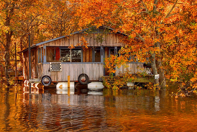
Floating camp on the Ouachita River by FinchLake by finchlake2000 on Flickr (licensed CC-BY)
While you can increase the saturation of an image when editing, do be careful with this. There's a fine line between a strongly saturated image and one that just looks overcooked and strange.
If photographing reflective subjects (such as leaves), then a polarizer can be a great filter to use. This reduces reflections, helping to intensify the colors without giving garish results like artificially increased saturation can.
Manoa by Daniel Zedda on Flickr (licensed CC-BY) - polarizer used to reduce reflections (leading to stronger color) and lengthen exposure time
Using colors to convey emotion
When you want your image to give the viewer a certain feeling (which should be your goal with all images!) then the colors within the image become very important. A cool color such as blue or green can have a calming effect. Blue can also be used to make an image feel cold.
Field of dreams by Thomas Tolkien on Flickr (licensed CC-BY) - dominated by green color, creating a feeling of calm and connection to nature
Oranges and reds can give an image a stronger feeling of energy. They also impart a sense of warmth. The strength of the colors and the tone has an effect as well. Strong colors can feel more energetic, particularly if they are bright. Darker colors can give a sense of foreboding, depending on the context.

Fun Fair by Etienne Gérard on Flickr (licensed CC-BY)
Color doesn't have to accurate
White balance is typically used to ensure that neutral colors stay neutral. For example, under tungsten lighting a piece of white paper would typically be recorded as being orange in color, due to the color of the tungsten lighting. But by setting the correct white balance setting in the camera (or when processing a RAW photo) we correct for the orange color of the lighting, keeping the white paper neutral in color.
There are many situations where the 'correct' white balance is not necessarily the best choice though. For example, using the correct white balance when photographing a sunset would neutralize the warm golden lighting. Or when photographing on a cold and cloudy day you may want to keep the white balance set to daylight (rather than cloudy) to leave a cool blue tint to the images.

Untitled by A. on Flickr (licensed CC-BY-SA) - cold blue color created by using a tungsten white balance but shooting in daylight
You can also intentionally set the wrong white balance to give an image a certain color (which as discussed above, can give a certain feeling to the images). For example, many people prefer to use the cloudy white balance setting when photographing in daylight as it warms the image up and adds a bit more energy.
If you want to go even further, you can modify the colors of an image completely. If you look at infrared photos you'll probably see quite a few different variations on color. This is because infrared has no color that we can see, so the infrared light recorded needs to swapped into a color we can see. And there's no standard way to do this, hence the large number of different interpretations you'll find.
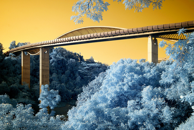
Passage. by digitalpimp. on Flickr (licensed CC-BY-ND)
But there's no reason strange and unusually colored images should be restricted to infrared. Just because most people see green light as being green doesn't mean that's the only way to see it.

Example of image modified using channel mixer to give unusual colors
You don't have to go crazy with manipulating colors either, you might want to try recreating the effects of certain types of film to give a vintage effect. There's lots of different ways you can play with color and lots of different effects you can achieve. Image editing tools particularly useful for modifying color are the Hue adjustment, RGB curves adjustment (adjusting each channel separately), and the channel mixer.
Don't use too many colors
While definitely not a strict rule to be followed at all times, you'll generally find you achieve more pleasing images if you try and restrict the number of different hues in the image. One of the basic rules of good composition is to simplify, and this follows that rule. Too many different colors in the image can be confusing - the viewer doesn't know where to look.
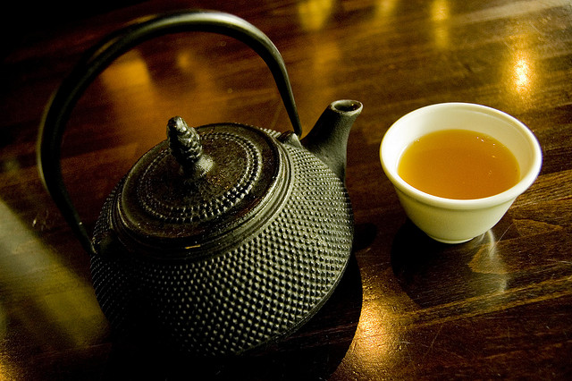
This green tea is orange by mendhak on Flickr (licensed CC-BY-SA) - nice photo making use of very few colors - the table is brown, reflections of lights on the table and the tea are orange, the teapot is black and cup is white (technically black and white are tones, not colors).
When referring to restricting the number of colors, I mean restricting your photo to a limited number of groups of colors. You may have an image with two main colors, and different tones and saturation of those colors. But you'll probably want to avoid images containing many vastly different colors, e.g. an image containing blue, purple, yellow, red, green, cyan, and orange could be a bit much.
Go pastel for portraits
Colors with low levels of saturation, i.e. pastel colors can work very well for portraits. They give a soft, sometimes even dreamy feeling to an image.
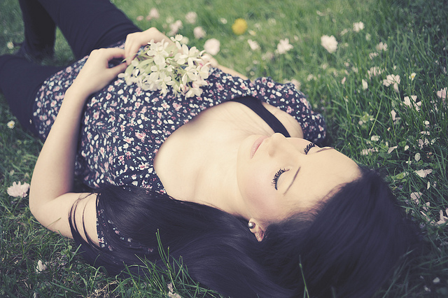
Δ† by 55Laney69 on Flickr (licensed CC-BY)
And it's not just portraits, either. Any time you want to create a soft effect, going for pastel colors can work well.
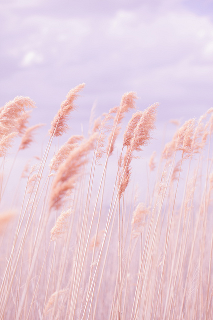
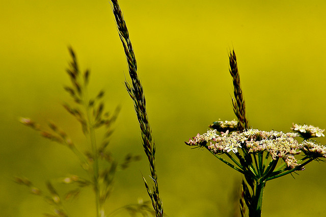
Dreamy Pastel Beach Grass by Poppy Thomas-Hill on Flickr (licensed CC-BY)
While increasing the saturation of an image when editing can often give a gaudy effect, there's no such problem when partially desaturating an image to get a pastel effect. If you go too far with the desaturation, you just end up with a slightly colored black and white image.
Pastels usually look best when the image is relatively low contrast. This can be achieved in-camera though careful use of lighting, to avoid a big difference in brightness between highlight and shadow areas. Or you can decrease the contrast when editing the image.
Making careful use of color in your photography can bring about a great improvement in your images. To help get yourself thinking more about the use of color, why not try setting yourself a color related photography project?
For example, taking photos only of scenes with a specific dominant color in them. Or taking photos that only feature different shades and varying saturation of a single color. Or looking specifically for compositions that feature complementary colors.
There's almost endless different color related projects you could try, the important thing really is to put your knowledge of use of color into practice. This will help you remember it, until eventually it becomes second nature.


