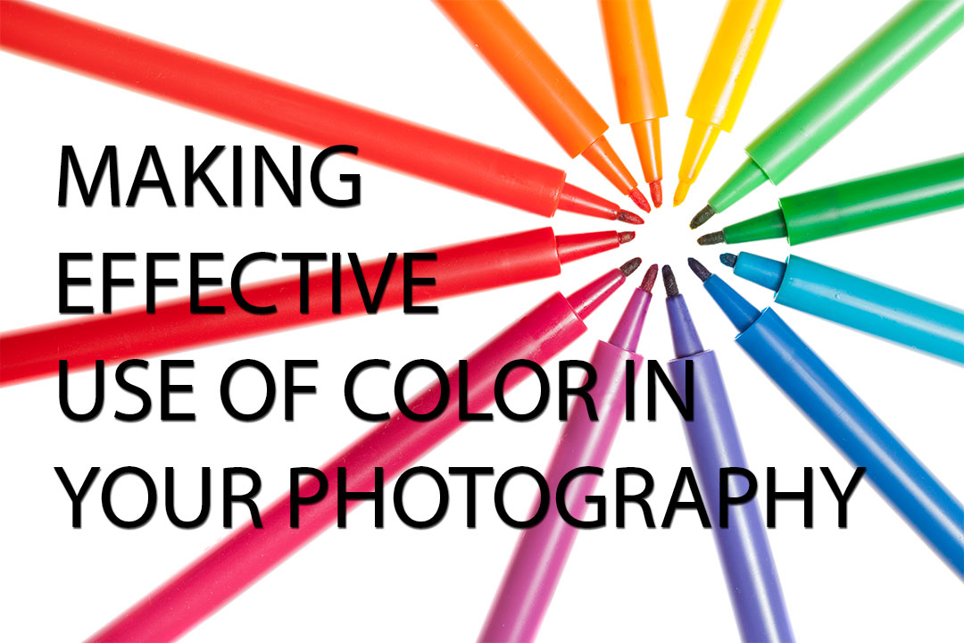
Making effective use of color in your photography
There have been lots of books written about black and white photography, but relatively little is written on the subject of color photography. In some aspects this is understandable - black and white can be trickier since we do not see in black and white, thus we need more guidance on it.
However, since we are so used to seeing (and photographing) in color, it can be easy to overlook certain points when creating a color photograph. In this article I want to share a few ideas to help get you thinking more about the use of color in photography, and how it can be used to improve your photos.
Color Theory - The color wheel
For understanding how colors work together it is helpful to have an idea of the basics of color theory, in particular the color wheel. The color wheel is a circular arrangement of colors.

BYR color wheel by Sakurambo (licensed CC-BY-SA)
The wheel is typically based on the subtractive primary colors, Red, Yellow, and Blue. Think painting, where adding yellow and blue together will give you green. The three primary colors are spaced around the circle with an equal distance between each one. Each color blends into the color next to it, thus creating the colors between them.
The secondary and tertiary colors between the primary colors are often displayed as separate blocks, as in the illustration above. However, the color wheel can also be displayed with the colors seamlessly blending from one color to the next.
The color wheel can be very useful for determining how different colors will work together, which is what we'll look at now.
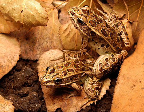
Complementary colors
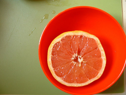
Complementary colors are colors that are opposite each other on the color wheel. Composing an image with an object of one color against a background of its complementary color can provide a source of very strong color contrast. It really makes the subject pop against the background.
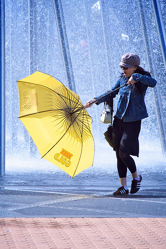
complementary colours by Brent 2.0 on flickr (licensed CC-BY-ND)
Examples of complementary colors are blue and orange, red and green, or yellow and purple. You don't need to choose the exact opposite color of your subject, but do look out for colors that are roughly opposite one another. This contrast will be strongest when both colors are bright and highly saturated.
complementary colors by tracy ducasse on flickr (licensed CC-BY-ND)
Analogous colors
An analogous color is one that is next to the color of your subject on the color wheel. For example, yellow and orange, green and blue, or blue and purple. This creates quite a different effect to a complementary color. Instead of the strong color contrast, you have a much more subtle effect.
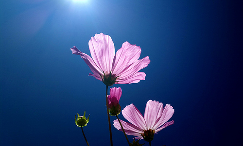
Flower by solarisgirl on flickr (licensed CC-BY-SA)
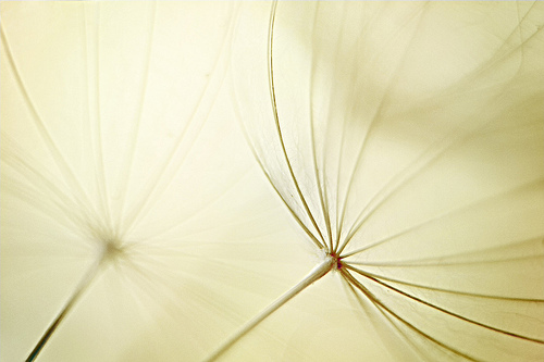
Monochromatic color
Monochromatic color is where you only use a single color in the image. This type of color photo is similar to black and white photography, in that typically you will be relying on differences in tone (rather than color) to define the photograph.
Bronze by Matt Reinbold on flickr (licensed CC-BY-SA)
However, it does not have to be differences in tone alone that distinguish the different elements that make up the photo. Differences in saturation can also be used. Bear in mind that subtle differences in saturation will be difficult to make out, unless there is some difference in tone as well.
Blue on Blue by Jocelyn Kinghorn on flickr (licensed CC-BY-SA)
Use of Color Saturation in Photography
The strength of colors in a photo plays an important role. An image with strongly saturated colors will often feel vibrant, full of life, and energetic. On the other hand an image with soft desaturated pastel colors can feel much more dreamy, or even somber, depending on the subject matter.
It is important to bear this in mind when composing your photograph. Choosing the correct amount of color saturation can help put forward the story you want to tell. For example, a photo to promote an energy drink or sportswear is likely to use strong contrast and saturation. For a dreamy soft focus flower photo, low color saturation will work much better.
Color against gray
Another good way of making a subject stand out from the background is to have the subject in color, while the rest of the image is in black and white. This type of image is often achieved artificially, using selective color. Using editing software the image is desaturated, then the color is painted back in where it is wanted.
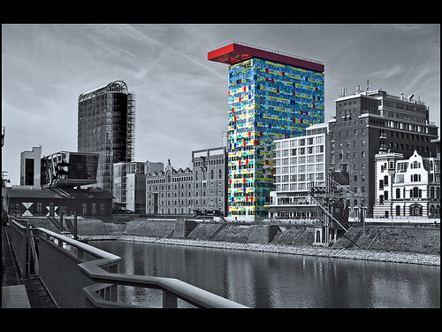
Düsseldorf (Medienhafen) by Bert Kaufmann on flickr (licensed CC-BY)
However, it is possible to achieve this effect in camera as well. You just need to find a background that is lacking in color. This can be difficult to find in nature - stones and rocks or a dull gray sky are your best bet for a neutral uncolored background. Water can also work on a gray day, reflecting the overcast sky. Snow in winter, or white sand on a beach are other possibilities.
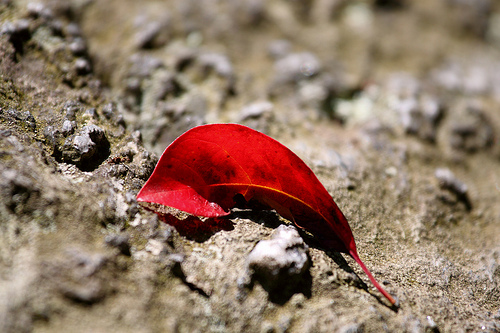
Great Falls Red Leaf by Mr. T in DC on flickr (licensed CC-BY-ND)
In cities, dark tarmac, grey concrete, and white painted walls provide many opportunities for this type of photograph.
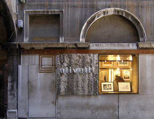
carlo scarpa, olivetti showroom, venice 1957-58 by seier+seier on flickr (licensed CC-BY)
Controlling color (hue) in your photographs
So far we've looked at the different ways you can use color in your photography to help your subject stand out, or give a certain mood to the image. But how do you actually apply this to your photography?
The first is to look out for certain color combinations. You may spot a subject against a background with a complementary color that you wouldn't have otherwise noticed.
If you find a subject you'd like to photograph, can you photograph it from a certain angle to include a colored background that will work well with the subject? Or it may be a case of looking for an angle / framing to ensure you don't include a colored background that doesn't work well with the color of the subject.
If you're photographing a subject you have control over, such as a portrait photo, then think about color. If you have some backgrounds in mind, ask your subject beforehand to wear colors that will go well with that background. Or if you can't control what the subject will be wearing, then you can select a good background that will complement the colors the subject is wearing.
As well as the color of the background and subject, we can also modify the color of the light. In terms of natural light, photographing a subject at sunrise / sunset, noon on a clear day, or any time on an overcast day will all give slightly different colors to the light. Sunrise / sunset will give warmer (more orange) light, while overcast weather will give quite cool (more blue) light.
If you're using artificial light, for example a speedlight flash, then you can color the light using gels. These are just colored pieces of plastic that you place over the flash. The light from the flash then passes through the plastic, and takes on that color. This technique can be used to good creative effect.
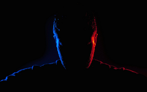
128/365: Frio/Calor by Andrés Nieto Porras on flickr (licensed CC-BY-SA)
Colored reflectors can also be used to change the color of light. You can't usually buy colored reflection panels, but you can use other materials instead. Put someone near a well lit green wall, and the light that bounces off the wall onto your subject will obtain a green tint. Or place a piece of bright red cloth near your subject, and this will reflect red light back towards your subject.
Using reflected colored light in this way is a lot trickier than simply using a flash with a colored gel. But it may be a solution in some instances when you want colored light and a flash is not practical.
White balance is another tool in your arsenal of color control methods. By setting a specific white balance you can achieve an image that is warmer (more yellow) or cooler (more blue) than it would be with a neutral white balance. Note that changing the white balance will change the color across the entire image. You can read more about White Balance here: What is White Balance?
And of course, you can use image editing software to modify the colors in an image. You can completely change the color of a whole image, or just modify the color in one small area. You can increase saturation, or reduce it. You can create selective color photographs, or change the hues of certain colors. The possibilities are virtually endless.
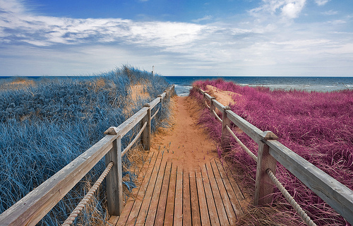
Split Tone Beach Boardwalk - Blue & Pink by Nicolas Raymond on flickr (licensed CC-BY)
Controlling saturation in your photos
Some of the points in regards to controlling saturation are the same as those in regards to controlling color. You can actively look for saturated / desaturated backgrounds or subjects depending on your preference. You can ask a model to wear plain or pastel colors, and use a neutral colored background if you want. And the saturation of an image can easily be modified by using image editing software.
Most cameras have a setting for saturation. You can use this to increase or decrease the saturation when taking photos. Personally I prefer to keep this set to a neutral setting, rather than changing it on a per photo basis. I then control the saturation later in image editing software. But this camera setting is certainly worth being aware of.
Some photographers say that shooting in overcast conditions will give images with higher saturation. Others say the opposite, that shooting in overcast conditions gives images with low color saturation.
In my experience saturation levels in overcast and sunny conditions are both about the same. Images often look 'punchier' in sunny conditions though due to the higher tonal contrast. You can easily increase the contrast of an image shot in overcast conditions (flat lighting) when processing your photos for a punchier shot.
Rain (or any other form of water) can increase saturation. This is particularly true for porous items. Red brick walls can appear a much deeper red after rain, and leaves can also appear more colorful. Wet tarmac and rocks can appear much darker, which, while not really affecting their color, gives stronger tonal contrast against brightly colored items.
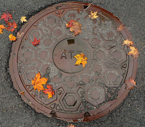
Wet Wednesday leaf Manhole by DM on flickr (licensed CC-BY-ND)
A polarizing filter can be used to increase saturation when photographing certain subjects, such as foliage. The filter reduces reflections (glare) from the leaves, resulting in an image with higher saturation.
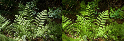
Effect of a circular polarizer on fern leaves by David J Laporte on flickr (licensed CC-BY)
A few other quick points to make regarding color photography:
- Make sure you convert your images correctly when uploading them to the web. Otherwise your images with vibrant colors might show up looking rather dull. See this article for more info: What are color spaces / color profiles and why are they important?
- While not essential, ensuring that you have your monitor calibrated correctly can be useful to make sure that colors you see on screen are the colors in the actual image. You can read more about that here: Why calibrate your monitor?.
- If you're printing your photos at home, then calibrating both your monitor and printer can help you achieve images that print as close as possible to how they look on screen. An important point is that printers can't reproduce all the colors that a screen can display. Most image editing software will offer a proof mode that allows you to get a preview of how the image will print.
To sum up, when photographing in color, don't forget to think about how the colors in the scene work together, and whether they are helping portray the message you want your photo to give. Finally, bear in mind that not everything works best in color - sometimes foregoing the color and photographing (or processing) in black and white may actually give the best image.


