Color Contrast Explained
Color contrast can be used in color photography to help a subject stand out, or alternatively, blend in, with a background. It's also important for black and white photography as an item that stands out due to a strong color contrast may disappear into the background in black and white.
In this article we'll look more at color contrast - how it can help or hinder, and how you can control it.
Why color contrast matters
In color photography color contrast is very important because a strong color contrast will make that part of the image jump out at the viewer. If you have a strong color contrast between your subject and the rest of the image, this is a good thing.
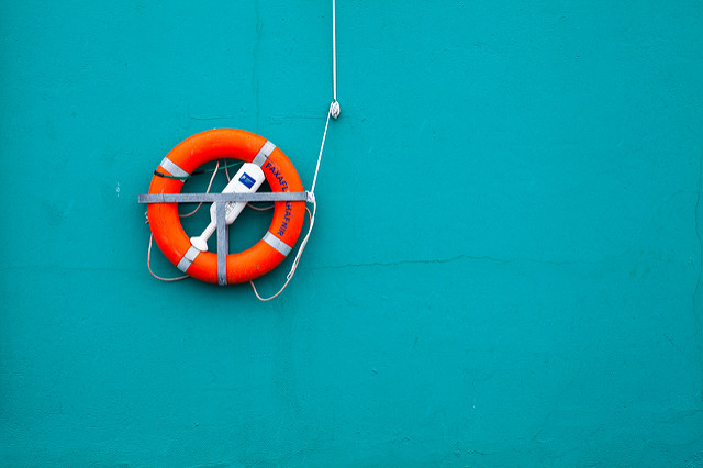
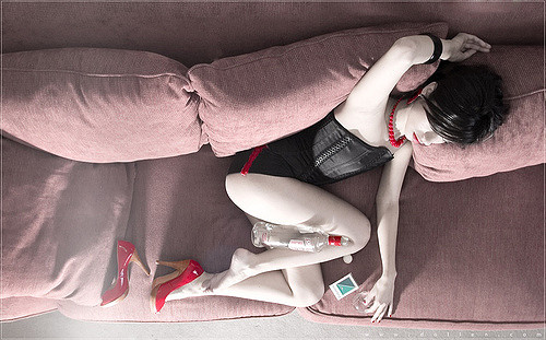
CONTRASTS by Daniel Sjöström on Flickr (licensed CC-BY-SA)
While if you have a weak color contrast between your subject and the rest of the image, but some unimportant part of the background has a strong color contrast against the rest of the background, then this is a bad thing. The unimportant part of the background will attract the viewer's attention rather than the subject.
Of course, there other aspects that can also be used for putting the viewer's attention where you want it, such as tonal contrast as we discussed previously. But it's generally not a good idea just to rely on one technique for directing the viewer where to look in your image, but rather to use several techniques in harmony.
Color contrast (or rather, the lack of it) also needs to be kept in mind when photographing in black and white (or with the intent to perform a black and white conversion). For black and white photography you want to focus on tonal contrast, not color.
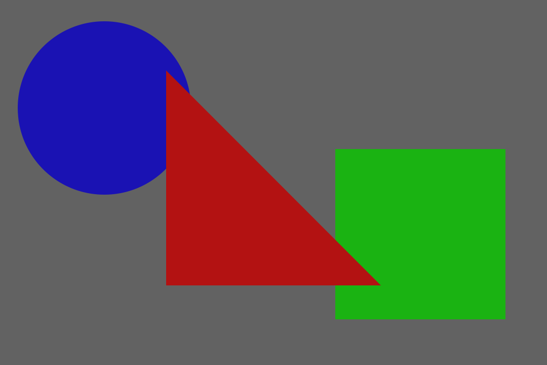
Although this image only contains a single tone, the shapes are easily identifiable due to their color differences between each other and the background.

With the color removed the shapes are no longer visible as they all have the same brightness as each other and the background.
For black and white photography it can be very useful to preview the image on the camera's LCD. (Or use a camera with an Electronic Viewfinder that has a live preview mode). This shows the image as it will appear, with tonal contrast only.
However, color contrast can be converted into tonal contrast to a certain extent for black and white imagery when converting from an original color image. And we'll look at this later in the article.
Contrasting with Hue
Normally when we think of color contrast, we're thinking of (or looking at) two colors with very different hues, such as yellow and purple. Colors that are opposite on the color wheel, known as complementary colors contrast strongly against one another.
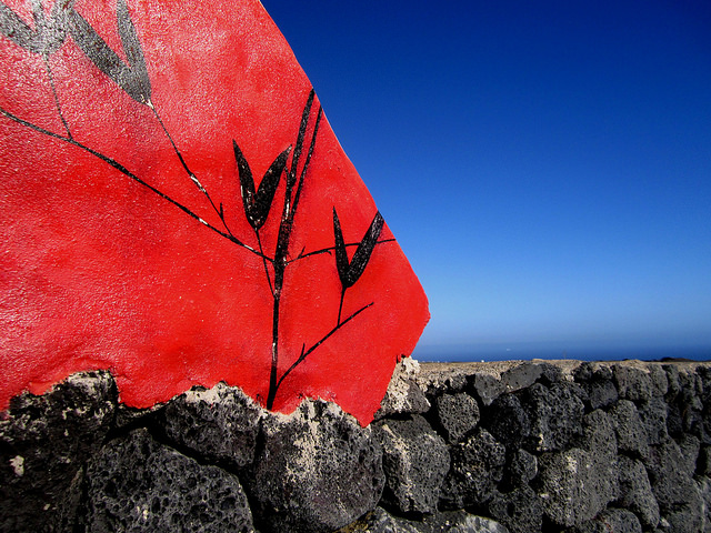
Color Contrast by Simon Turkas on Flickr (licensed CC-BY-SA)
Whereas colors that are close together (such as red and orange) have very little color contrast.
Contrasting with saturation
The other way that colors can contrast with each other is in how saturated they are. A very strong green color can contrast with a drab pastel green, even if both are a similar hue and tone.
Selectively Seductive by dollen on Flickr (licensed CC-BY-ND)
The more saturated colors are, the more they will contrast with other colors. A strong green and strong red color contrast against each other much more than a weak pastel green and red.
Adjusting color contrast in camera
Generally, adjusting color contrast in camera is just a case of altering your framing to include or exclude parts with strong color contrast. If you have a movable subject (such as a person), then you can direct them on what colors to wear and what background to stand against.
With static subjects and scenes you're much more limited. The angle that you photograph from can have some effect. For example, shooting from a low angle you'll generally get much more of the sky behind the subject. Whereas shooting from a higher angle you'll get much more of the immediate background behind the subject.
For example, for an orange painted house on a sunny day you might want to use a low angle so the house will contrast strongly with the blue sky behind it. Whereas at sunset the sky will be more orange tinted, so instead you might use a higher angle so the color of the house contrasts with the surrounding area.
Of course, that's assuming you want a strong color contrast. Sometimes an image will be stronger using similar colors for the different elements, and some other form of contrast to attract the viewer's attention to the subject.
Artificial lighting can also be colored and used to create a color contrast. By lighting part of the image with colored light, that part can be made to stand out from the rest of the image.
Adjusting color contrast in post
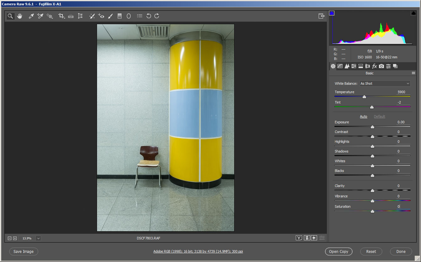
Probably the easiest way of adjusting color contrast is using a Hue / Saturation adjustment. I'll be illustrating using Photoshop CC but GIMP allows adjustments in a very similar way. Adobe Camera RAW and Lightroom also allow adjustments through the HSL settings, but these are a bit more limited than what Photoshop and GIMP offer.
The Hue / Saturation tool allows you to select a range of colors that you want to adjust. By default the colors selected to be changed will be 'Master', which means apply the adjustment to all colors equally. However, we can change this to apply the adjustment to only a selected range of colors.
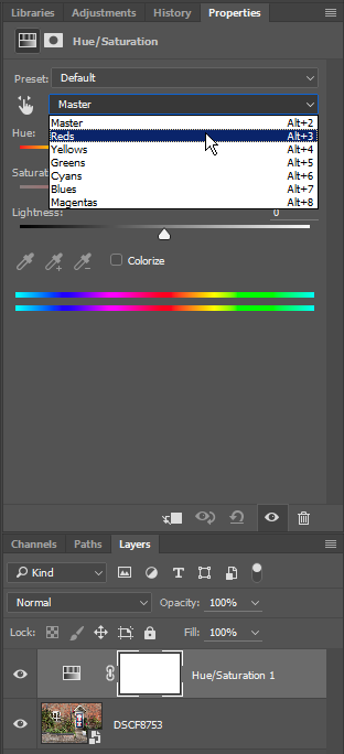
Selecting range of colors to adjust in the Hue / Saturation adjustment in Photoshop
Reds selected
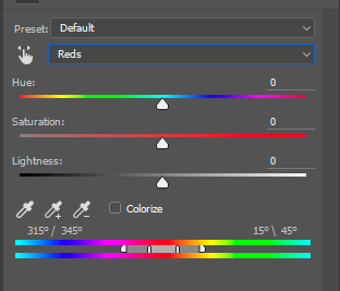
In Photoshop, after selecting a color range to modify, you can further refine the color range using a small slider. The central area of the selection means the adjustment will be applied fully to the range of colors covered by this area. Clicking and dragging on this area allows you to change which colors will be affected.
Either side of this is a darker area and then a marker. The darker area indicates a gradual fade of the effect. So right next to the central area, the effect will be near 100%. But at the marker end of the dark gray area, it will almost 0%. This makes the transition of the effect much smoother and less noticeable than if it was affecting a certain group of hues at 100% and then all other hues weren't affected at all.
You can click and drag the end markers to enlarge this transition area, or to reduce it. You can also click and drag the lines between the central area and transition area to enlarge or reduce the central area where the effect is applied at 100%.
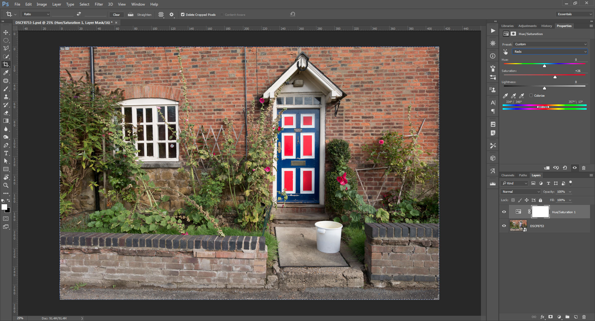
Here I've adjusted the range of hues to be affected to the reds only, to avoid affecting the orange brick wall
Using this technique you can adjust the saturation of different hues in your image to increase or decrease color contrast as wanted. For my example image I wanted to increase color contrast in the painted door, reduce color contrast of the greenery, and leave the rest of the image as-is.
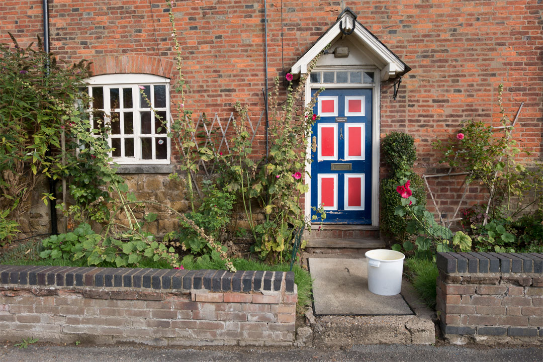
Image before adjustments
Using a Hue Saturation adjustment this is perfectly possible without any masking needed at all.
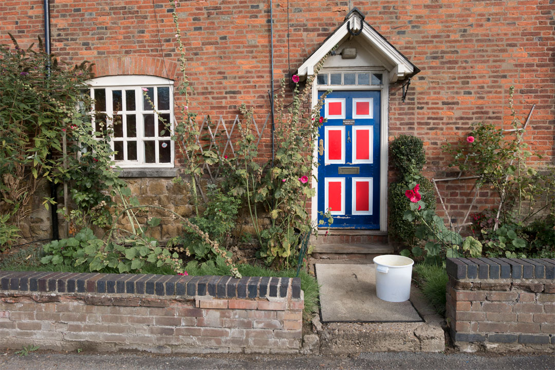
Image with Hue / Saturation adjustment
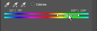
When trying to refine the selection of hues that a particular hue / saturation adjustment is altering, I find it helpful to set the saturation to a very high level. This makes it very easy to see what hues are being affected.

Increasing the saturation to check the yellow-green hues being affected
Converting to B&W
Most image editing software will offer a black and white conversion method that allows you to specify how colors map to tones. By default, color information is just discarded and the image desaturated. But by using the black and white conversion mode you can specify that some colors should be darkened, while other colors should be brightened.
Color image before B&W conversion
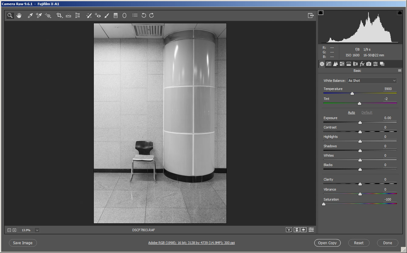
Simple desaturation - the bands in the column are lost becuase although they were different colors, they were are very similar in brightness.
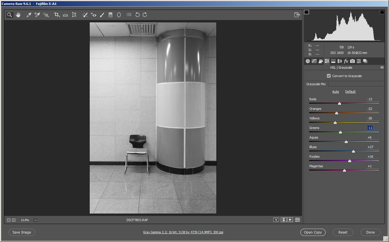
Manual B&W conversion with yellows converted to darker tones
This actually gives you more control over the image than just shooting straight to black and white would. If you want to darken the sky, you can pull down the cyans and blues. While if you want brighten grass, you can pull up the greens and yellows.
It's quite a simple process and the results can be much better than a simple desaturation.
Well, that wraps up this article on color contrast. I hope you found it helpful, and as always feel free to leave a comment below or contact me if you didn't understand anything, or just have a differing opinion on any of the points raised.


