Understanding Tonal Contrast for Better Photos
Tonal contrast refers to the difference in brightness between different areas of an image. While important for all photography, tonal contrast is particularly important for black and white photography, since there is no color contrast to be had.
Understanding the differences between high and low tonal contrast and the feelings different levels of contrast can contribute to an image are quite important for good photography. In this article we'll look at this in more detail, also covering how you can affect contrast to get the look for your images you want.
The Histogram
In this article I'll be using the histogram to demonstrate the range of tones of an image, so it's best I start with a quick explanation of the histogram.
A standard image has 256 levels of gray, ranging from 0, pure black, to 128, middle gray, to 255, pure white. The histogram is a graph of these tones, showing how much of each tone the image is formed from.
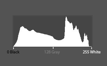
So a histogram with a large peak on the left side shows the image has a lot of dark tones. One with a large peak on the right side shows it has a lot of bright tones.
While you can probably judge for yourself the range of tones in an image just by looking at it, the histogram can still be useful to get a more exact picture. For more on the histogram, you can see Stop Exposure Problems Ruining Your Shot.
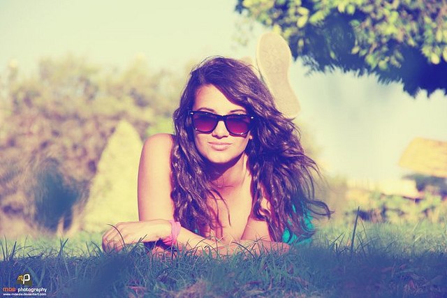
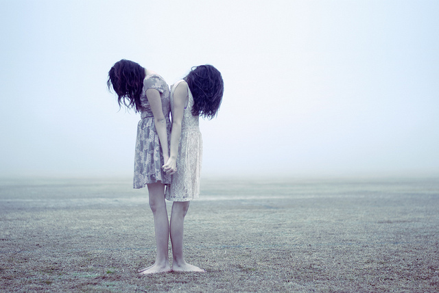
High contrast
If the photo has a lot of very dark tones and very bright tones, such as a dark silhouette against a brighter background, then we can say the image has a high level of tonal contrast.
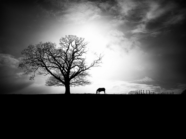
Black and White Landscape with Horse by Nick Page on Flickr (licensed CC-BY)

High contrast photos tend to 'pop' out at the viewer. Depending on the subject matter, a high level of contrast can help give a feeling of edginess and grit. Many street photographers, for example, produce photos with relatively high levels of contrast.
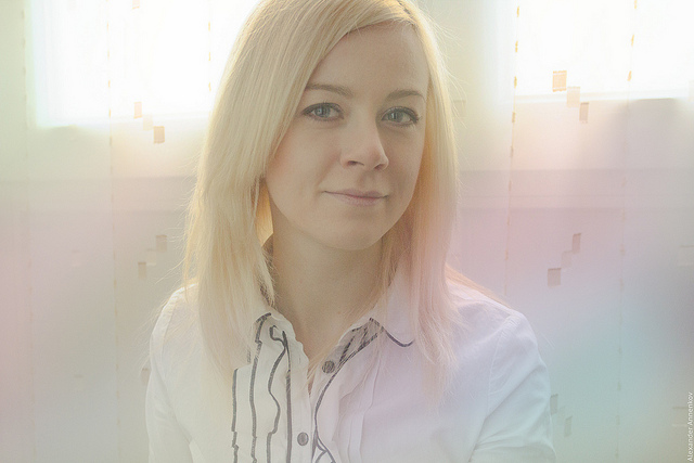
Normal (medium) contrast
If the photo has a range of tones from pure black to pure white, but the tones are evenly distributed (i.e. the tones aren't bunched up mainly in just the shadows and highlights), then this would be a medium contrast image. This would be the majority of photos.
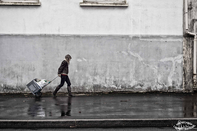
Untitled by laurent Bertrais on Flickr (licensed CC-BY)

Low contrast
Low contrast images are those where the photo contains a range of tones that are very close together. Normally this is where the photo is mainly midtones, with no pure black or pure white.
Season of Colors by Mohamed Adel on Flickr (licensed CC-BY-SA)

But it can also be an image that is very dark with no bright areas.
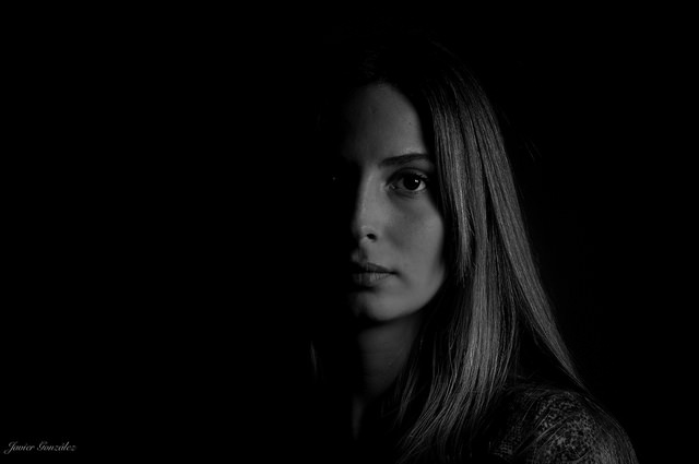
Low Key Sofia by Javier González on Flickr (licensed CC-BY)

Or an image that's very bright, with no dark areas.
Untitled by Marcus Pink on Flickr (licensed CC-BY)

Low contrast images don't jump out at the viewer so much. Of course, this does depend where the image is being viewed - a low contrast image surrounded by other high contrast images will jump out simply because it is the odd one out (we'll look at a similar theme in a later article on content contrast).
Low contrast images tend to have a more soft and dreamy feeling. It's also a good choice for lending images a vintage look. Low contrast is quite popular for location portrait photography (less so for studio portraits).
Getting the right level of tonal contrast in-camera
There are two things that determine the levels of tonal contrast in an image before any post-processing - the subject matter and the lighting.
If you photograph a black object against a white background it will give you a high level of contrast. While a gray object against a very slightly darker gray background will give you a very low contrast image.
Often we can't control our subject matter, but for portraits it is possible to some extent. You can try to find an appropriate background for your subject to stand in front of, to give the contrast you're looking for. You might even go so far as requesting the subject(s) to wear specific clothes to give the level of tonal contrast you want.

Morning Shoots by Michael Pravin on Flickr (licensed CC-BY)
But in the main, it's lighting that we use to get a specific level of contrast in-camera. Bright, direct lighting will give bright highlights and deep shadows, giving you a high contrast image. Examples would be shooting outdoors at noon on a cloudless summer day. Or using an undiffused flash pointed at the subject from an angle.
Very directional lighting can also give you a high contrast look. If part of the subject is lit with bright light, while part is in deep shadow, then you'll get a high contrast image. This is true even if the quality of the light is quite soft.
high noon and wintersun by glasseyes view on Flickr (licensed CC-BY-SA)
Medium contrast comes from 'normal' shooting conditions. Shooting during the morning or afternoon outdoor (not midday under the bright sun) will typically result in images that are neither high nor low in contrast. Using a lens hood to block stray light from hitting the lens helps keep contrast at a good level.
Low contrast can be created when a subject is very evenly lit. For example, photographing a subject outdoors on a heavily overcast day, when lighting has very little directionality to it. Similarly, photographing a subject lit with evenly balanced soft light from all sides will produce a low contrast image.
Someone was trembling for fear of the tempest, Somebody silently reached for their hand by Daniela Brown on Flickr (licensed CC-BY-ND)
Another technique for low contrast images is to photograph a backlit subject, especially if the light source is within the frame. You need to ensure that you expose (or even overexpose) for the subject (so that they're not just a silhouette). You'll end up with a bright background and low contrast subject, with no deep blacks.
White Soft Two by Alexander Annenkov on Flickr (licensed CC-BY)
The light shining into the lens causes what's known as veiling flare, and this decreases contrast across the whole of the image. Generally the older (and cheaper) the lens design, the more likely you are to get strong veiling flare. Conversely, the more modern (and expensive) the lens you're using, the less likely you are to get veiling flare.
Using a cheap filter on a lens can also increase your chances of veiling flare. So this might affect what equipment you decide to shoot with, depending on whether you're going for a high or low contrast look.
Adjusting tonal contrast in post using Curves
While you can adjust the tonal contrast at the time of the shot to a certain extent, it is usually much easier to adjust the contrast when editing your photos.
As well as being easier, if you ensure you take your photo to include as much tonal range as possible, then you don't have to make a decision whether to go high, normal, or low contrast at the time of the shot. You can set the contrast level when processing, and may find that a photo actually works better with a different level of contrast than what you would otherwise have decided on.
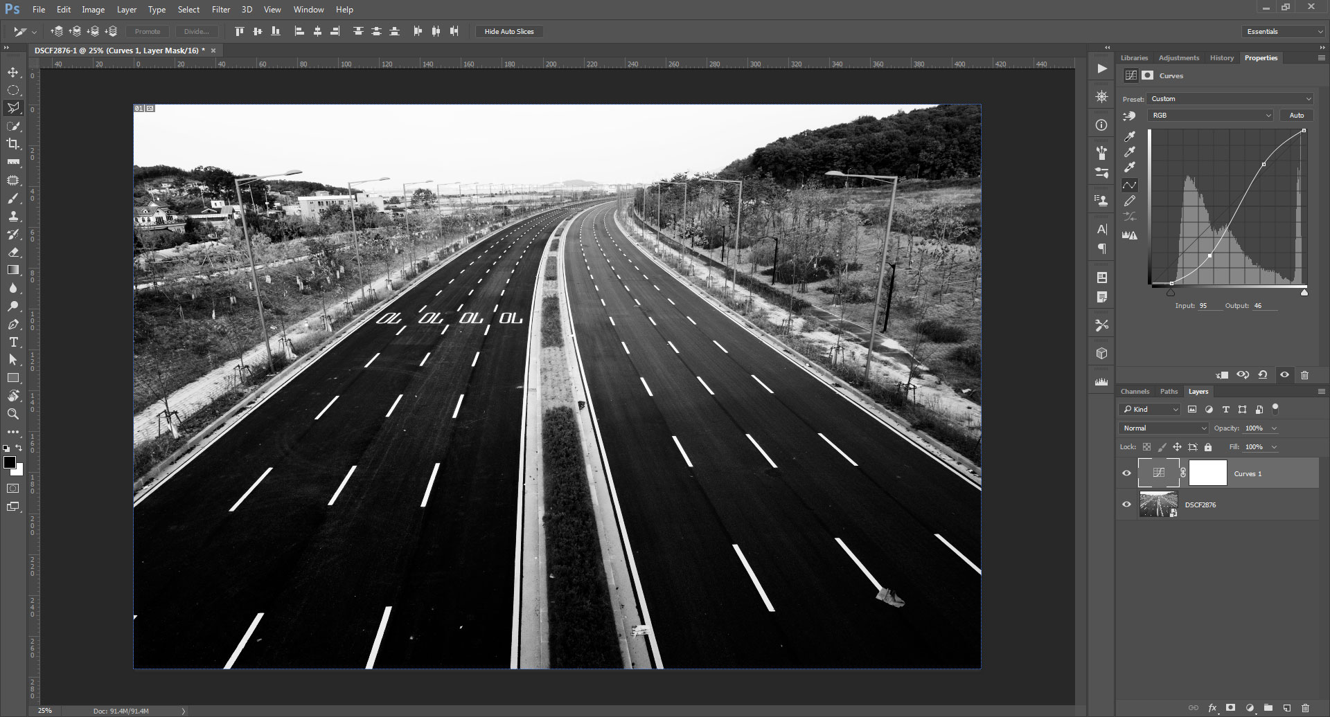
One of the simplest and easiest methods of adjusting tonal contrast in post-production is using curves.

To increase contrast using curves you have a couple of different options. The first is to pull in the black and white points.
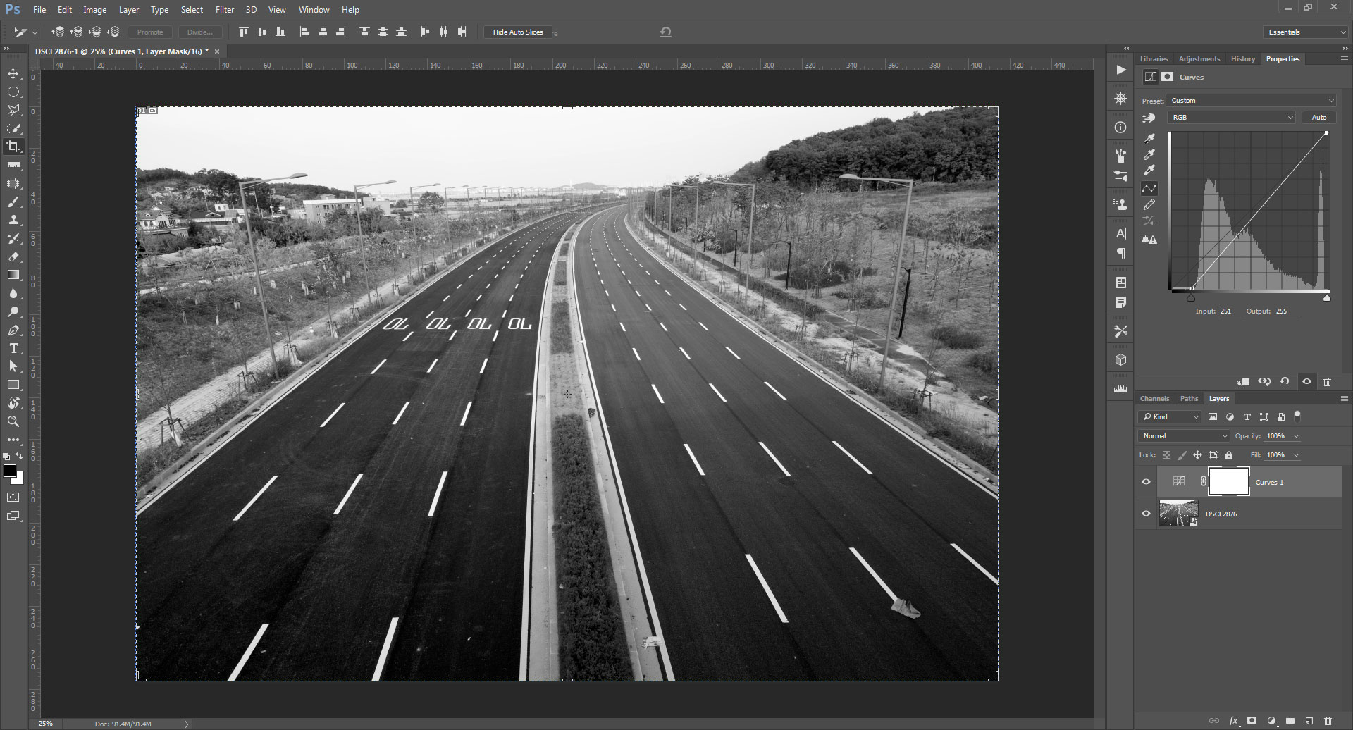
Depending on the image though this may clip highlights to pure white and shadows to pure black. If you don't want to loose detail in this way, then ensure you just pull in the points to the edges of the histogram. Note that in many cases either the white or black point (or both) may already be at the edge of the histogram, meaning some tones are already clipped and pulling the point in will clip further tones.
The second method for increasing contrast using curves is to pull the curve down in the midtone shadows (darkening all shadow tones) and pull it up in the midtone highlights (brightening all highlight tones). This increases contrast without clipping any tones (other than those that were already clipped before you made any adjustments).
You can also combine both these for an even greater increase in contrast.
Normally, using curves to increase contrast will increase both tonal contrast and color saturation.

By setting the blend mode of the curves layer to luminosity, we can ensure it affects the tones in the image only and not the colors.
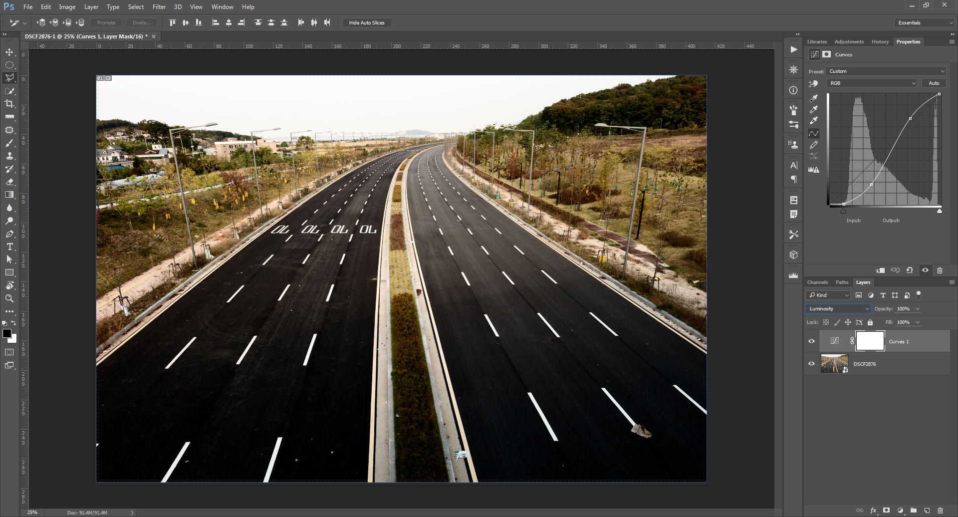
In some cases you may want to use two curves layers - one set to luminosity blend mode and another set to Color blend mode. This allows you to adjust the tonal contrast separately to the color.
It should be noted that using curves in Lightroom and Adobe Camera RAW, it is not possible to adjust the tonal contrast only when working on a color image. The two settings in these pieces of software that can adjust tone without color are the Shadows and Highlights adjustment sliders, which sadly don't provide a great deal of control.
Decreasing contrast using curves is basically the opposite of the techniques described above. You can pull the black point up and the white point down on the y axis to decrease contrast.
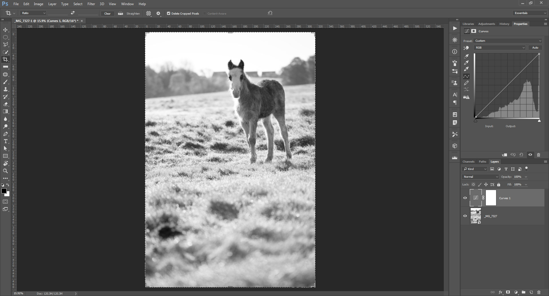
Image before adjustments

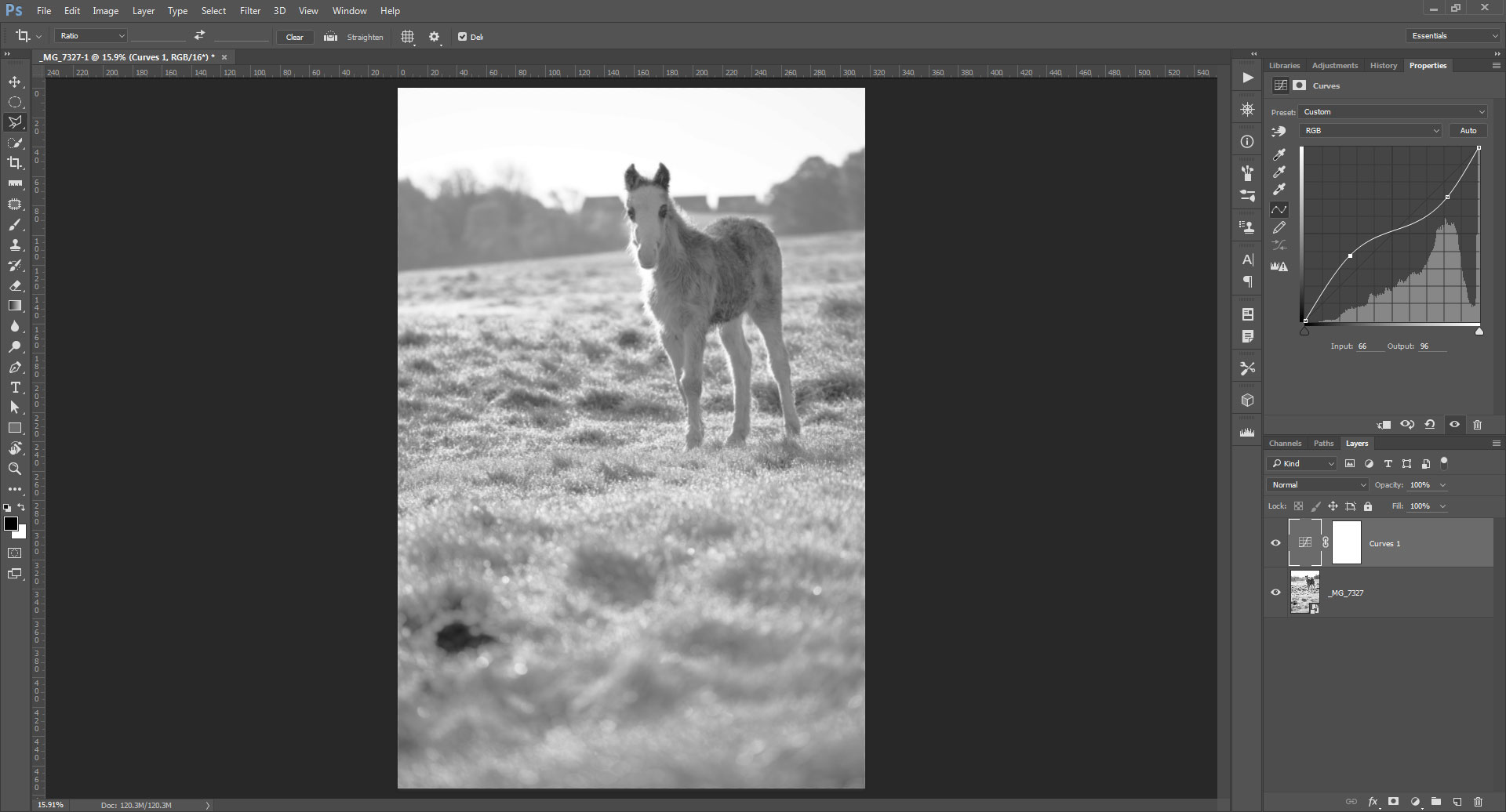
Contrast reduced by pulling in black and white points on the y axis
Creating an inverted S curve by pulling down the highlight midtones and pulling up the shadow midtones will also decrease contrast.
And of course you can combine both techniques.

Adjusting tonal contrast in post using Dodge & burn
Another technique for increasing contrast is dodging and burning. This is a much more selective, and also time consuming, technique compared to curves. You paint over areas to brighten or darken them.
The Dodge tool is used to brighten areas you paint over. In the tool options you can choose to brighten shadows, midtones, or highlights. For increasing contrast you'll likely want this set at the default of highlights.
Then brush over the brighter areas of the image to make them brighter still, increasing the contrast.
Similarly, the burn tool is used to darken tones and offers the same options of whether it should affect shadows, midtones, or highlights. For increasing contrast set it to shadows then brush over shadow areas to darken them still further.
Image with dodge and burn applied to increase contrast
Using dodge and burn to decrease contrast is quite unusual, but you can use it for that purpose if you wish. Simply set the Dodge tool to affect shadows only, then brighten the shadows using it. And set the burn tool to affect highlights, and then darken the highlights with it.
Image before any adjustments
Image with dodge and burn applied to decrease contrast
Using a pressure sensitive tablet and pen is highly recommended for dodging and burning. This allows you to more easily control how much you brighten or darken an area when painting it by how hard you press the pen down when painting.
I hope this article has given you a better idea of how to use tonal contrast effectively in your photography, and how you can alter the contrast to get the look you want. In forthcoming articles we'll look at two more types of contrast - color contrast and content contrast. Along with tonal contrast, understanding these can help greatly in creating stronger photographs.


